

Texas Fair Defense Project 2022
2023

When there are nine
2023

Sunflower
2023

Conversation
2023

Texas Fair Defense Project 2021
2021
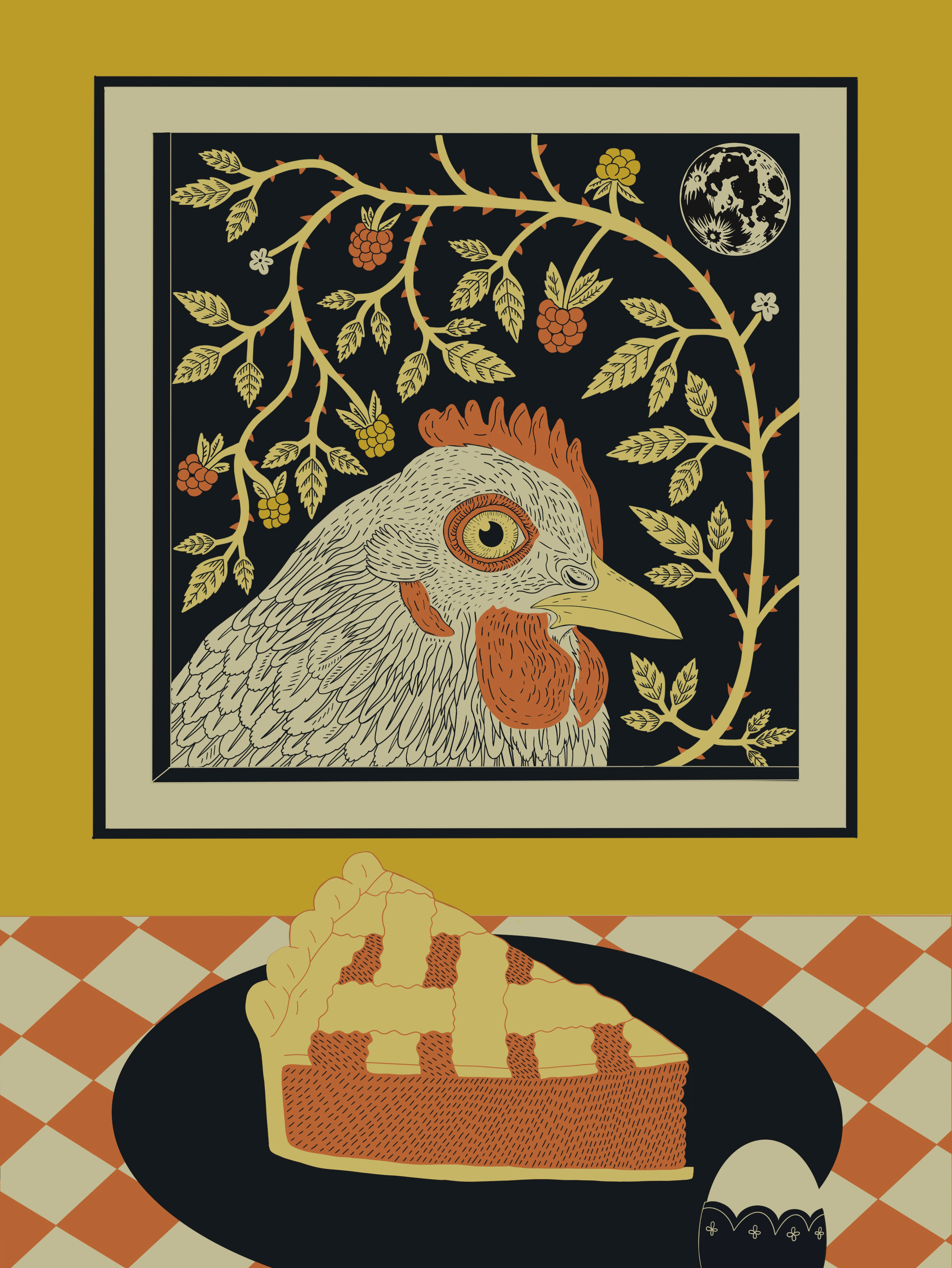
Chicken in the Window
2023
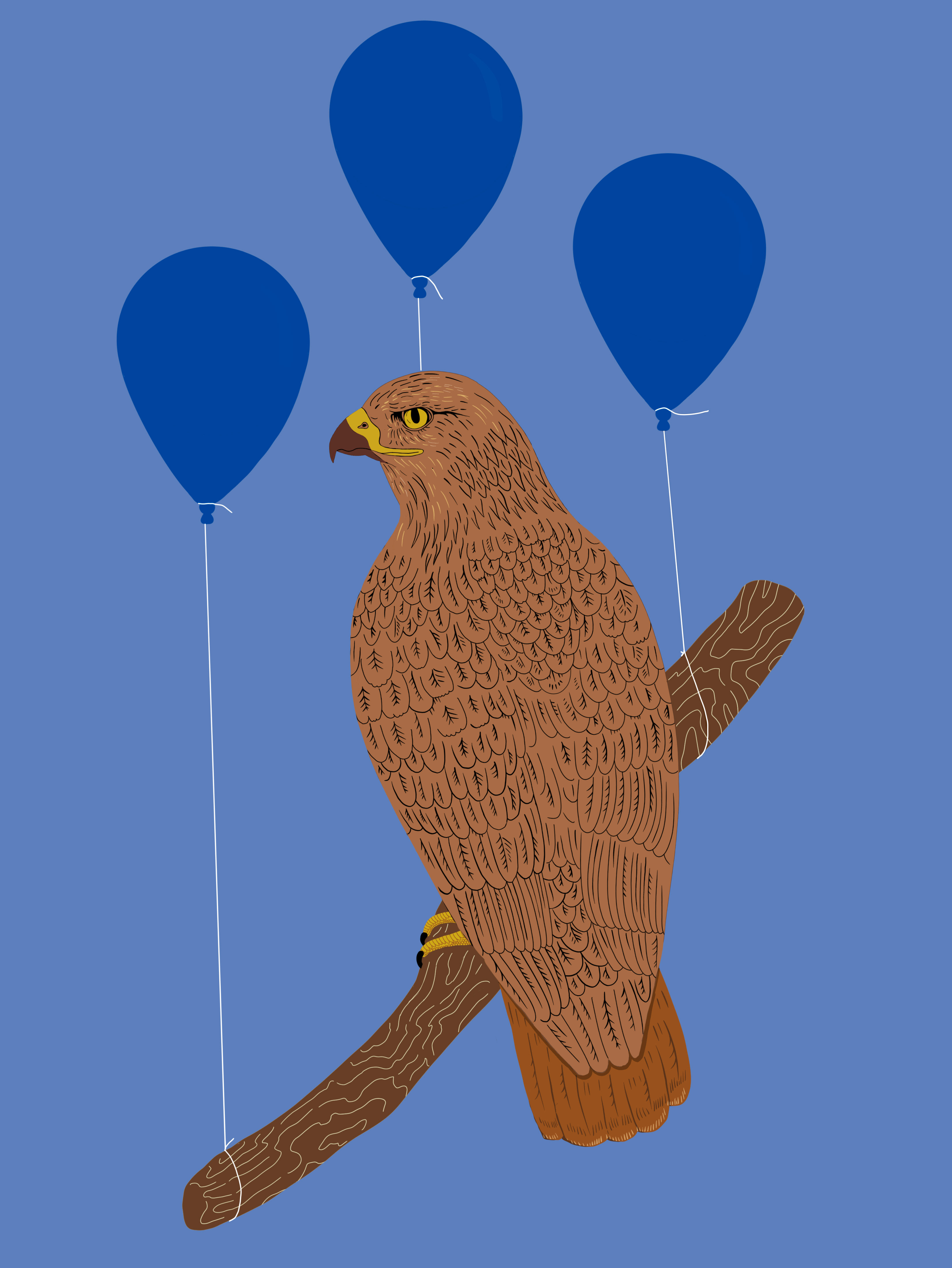
Hawk
2023